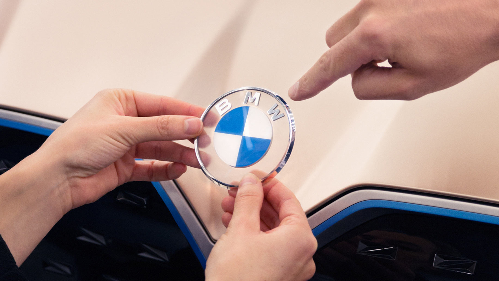
The BMW logo has been unmistakable for more than 100 years. From its origins in the early 20th century to its last redesign for the then-approaching new millennium, the iconic blue and white emblem has been a hallmark of automotive excellence over several generations. Continuing that tradition, the Bavarian-born company has released a redesigned crest fit for a whole new era.
The crest retains the same shape and core design inspired that uses the Bavarian flag’s colors as a nod to BMW’s heritage. The newest and most noticeable facet of the logo that the outer ring encircling that core is no longer finished in black. Instead, BMW uses a symbolic transparent finish to the outer ring as a testament to its commitment to openness. The new logo is also meant to coincide with the company’s transition to focus on producing a new generation of electric vehicles. The BMW New Logo and New Brand Identity will be used on graphics including in digital media while the traditional badge will still adorn the company’s vehicles.

